According to USA today, Starbucks sells four million coffee drinks per day. In 2015, Wendy’s generated a revenue of 1.87 billion dollars worldwide. Girl Scout Cookies are now sold in twelve mouthwatering flavors. Americans consume these products daily, monthly, or even annually, and have come to recognize their logos in an instant. However, many people don’t think twice about where these images came from. In fact, many of the logos we have come to easily identify have a deeper meaning behind their origin.
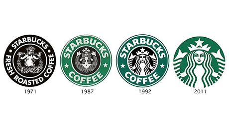
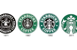
Starbucks Coffee Company originated in 1971, and it was then that a 16th Century Norse-woodcut of a twin-tailed mermaid, also known as a Siren, would become the face of their company. In keeping with the company’s seaport roots in Seattle, the Siren was a seductive, irresistible creature that also connected with the nautical theme that the founders of the company desired. Though the image has evolved with the company over the years, the Siren has and will remain a major symbol of the company.
Dave Thomas founded Wendy’s, based on his daughter Melinda’s nickname, in 1969. She soon became the mascot for the brand. She is featured as young girl with red hair tied into braids. Wendy Thomas has appeared in on-camera ads for the company, and as of September 2010, she owned or co-owned more than thirty Wendy’s locations. The original logo for the company was recently modified for the first time since 1983, and, although the image of Wendy remains, the young girl is depicted more vividly and also appears more mature. Upon the release of this new logo, many speculated that there was a hidden message within. In the ruffles of the girl’s collar, it was said that the words “mom” is worked into the design. A design blog called Stock Logos theorized this message might be due to the association of Wendy’s and “mom’s home cooking” or also to the image of Wendy herself, who appears much older in the new logo. According to the Huffington Post, however, Wendy’s released a statement saying the hidden message was “unintentional.”
The logo of the Girl Scout Brand, a brand that many Americans now easily recognize and look forward to, was first developed in 1978. The logo features three silhouetted faces of women, arranged in a diagonal pattern. Although it may appear plain and indirect, the logo was designed specifically to align with the core values of the company. The use of green, white, and black colors often symbolize support, peace, prosperity, and teamwork when used together. The arrangement of the women’s’ faces was designed to represent strength and self-confidence.

From the beginning, Heckler Associates played an integral role in the development of Panera Bread, including the design of their logo. The logo features an image of a woman with flowing hair holding a piece of bread. This woman is referred as “Mother Bread” and was used to separate Panera as a brand from other chains at the time.
Another easily recognized logo is the Golden Arches of McDonald’s, which were introduced in 1960. Designed by Stanley Meston, the logo symbolized the innovative architecture that the varying locations possessed; the roof was lined higher in the front than in the back, with two golden arches on either side. As the architecture of the restaurants evolved, the Golden Arches continued to make an appearance on windows, doors, and signs within the company.